00
Readhue
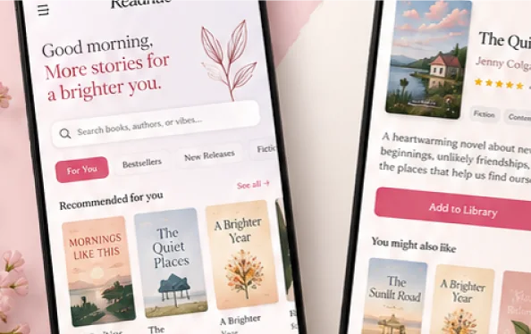
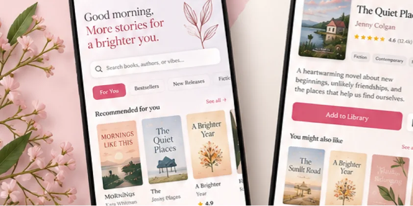
A mobile reading app connecting book discovery with personal preferences, mood and music. The project brings together user flows, detailed UI and a visual identity shaped around the reading experience.
Case study coming soon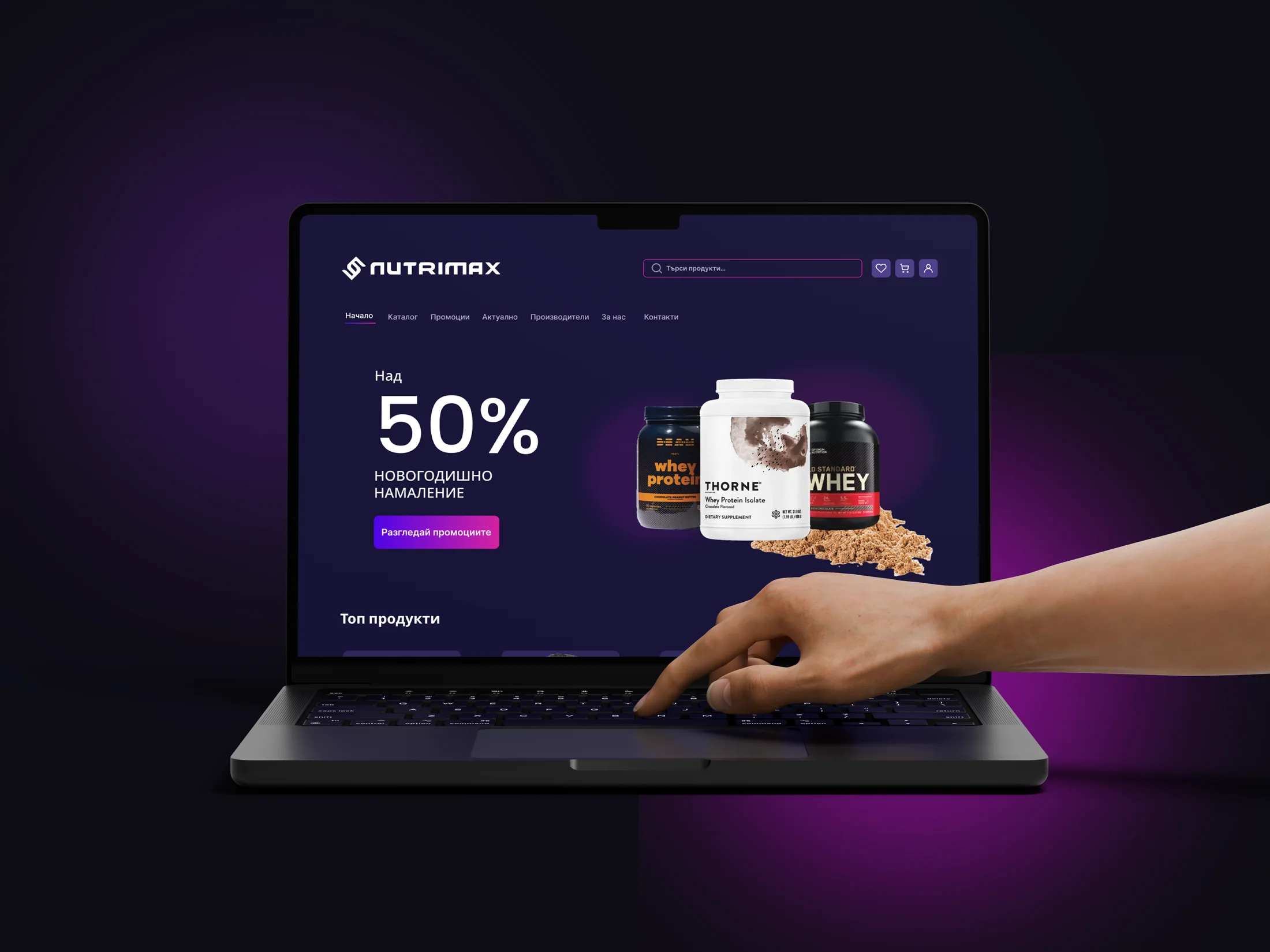
A clear shopping experience with a distinctive visual identity.
Desktop e-commerce design for the Bulgarian sports nutrition market, connecting product discovery, variant selection and cart review through a consistent interface.
01 / CONTEXT
Design Nutrimax's visual identity and desktop shopping experience for a multi-brand sports nutrition catalogue.
My contribution covered the brand identity, key shopping pages, information hierarchy and reusable UI components. I connected these elements into a consistent journey from discovering products to selecting a variant and reviewing the cart.
02 / THE PROBLEM
A multi-brand catalogue brings varied product names, pack sizes, flavours and promotional prices into the same space. The interface needed a clear hierarchy for browsing options and evaluating a specific product.
03 / THE CHALLENGE
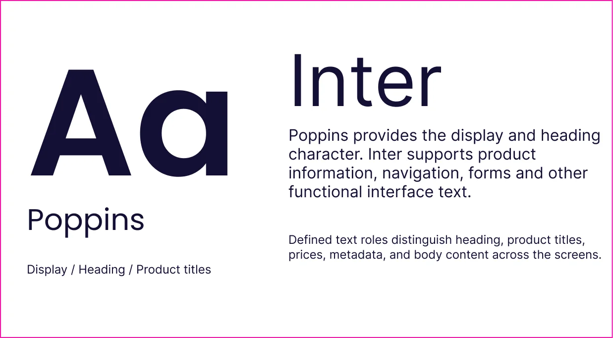
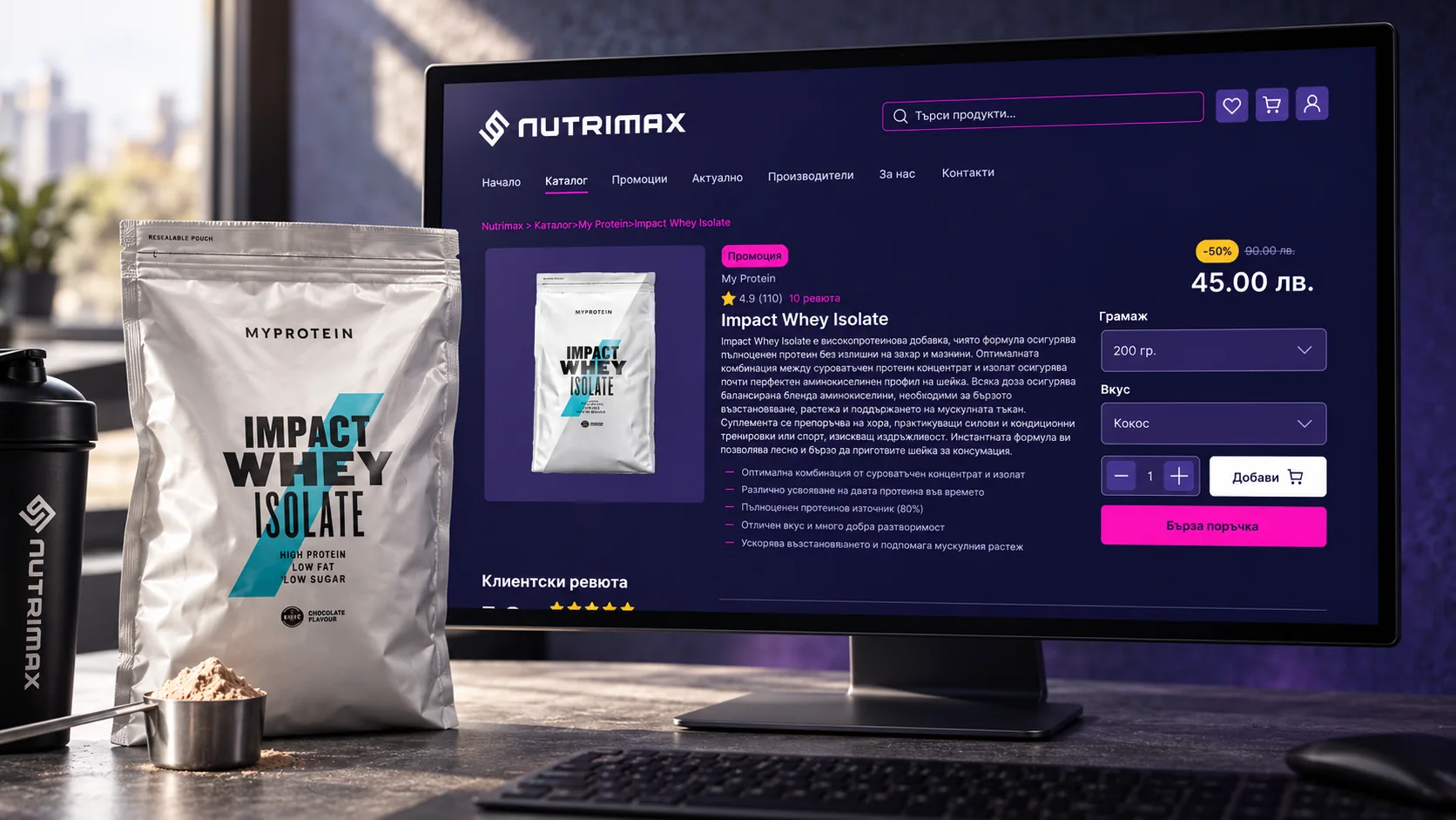
Make the brand vibrant and distinctive while keeping shopping controls predictable. Navy and violet had to coexist with bright packaging and pink accents, while long Bulgarian labels and product variants remained readable.
04 / THE SOLUTION
I connected the brand identity with a structured shopping journey: discover the range, narrow the options, select a variant and review the cart. Three design decisions shaped that experience.
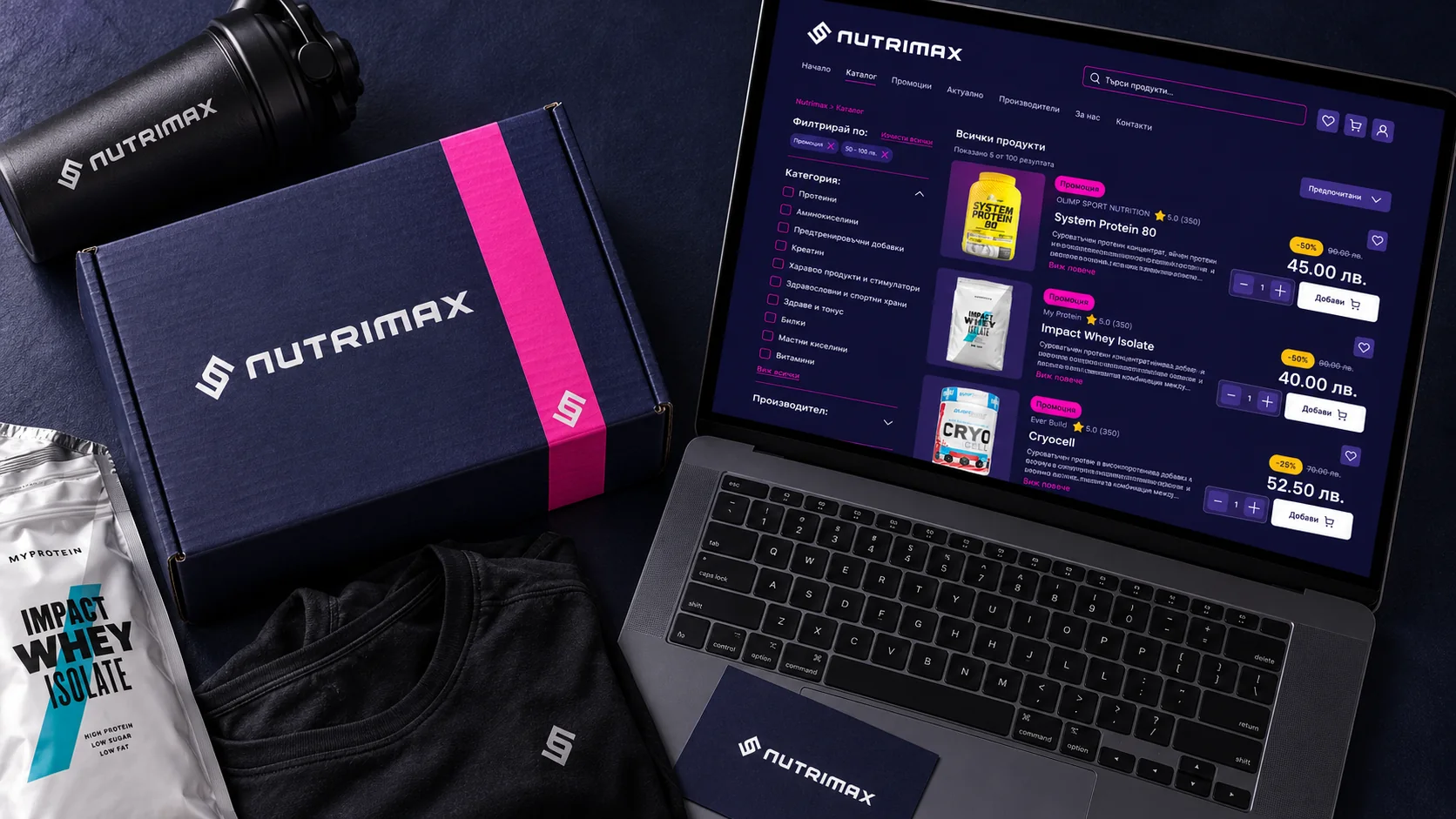
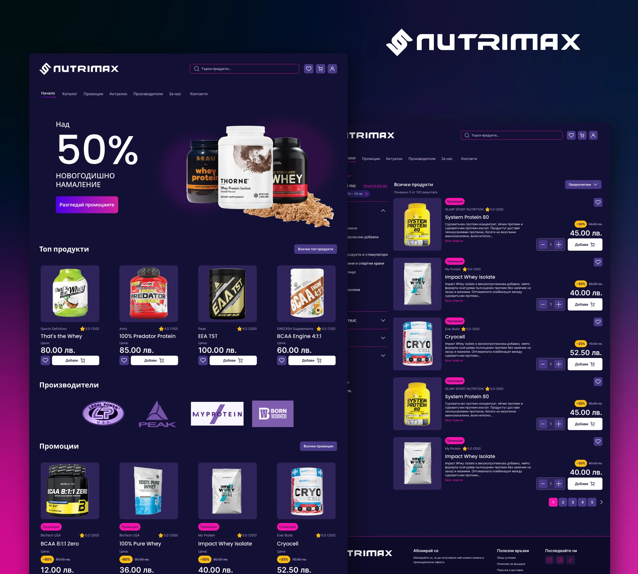
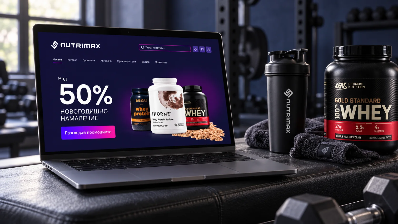
The homepage introduces promotions and featured products, while the catalogue supports more focused browsing through filters, sorting and active selections.
I gave these pages different priorities so that promotional content could attract attention without competing with the controls needed to narrow the range and compare products.
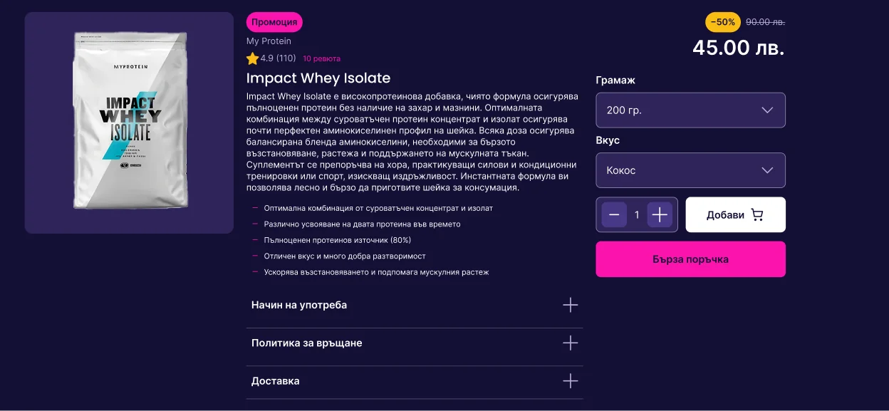
On the product page, pack size, flavour, quantity and purchase actions sit together beside the price. This keeps the details of the purchase in one place as someone chooses a variant.
Supporting information follows a separate hierarchy, giving people room to evaluate the product without separating the selection controls from the action they support.
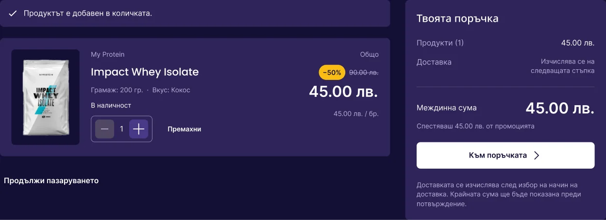
The cart carries the selected size, flavour, quantity and price into the next step. Keeping these details visible supports a final check and gives people a clear place to adjust their order before continuing.
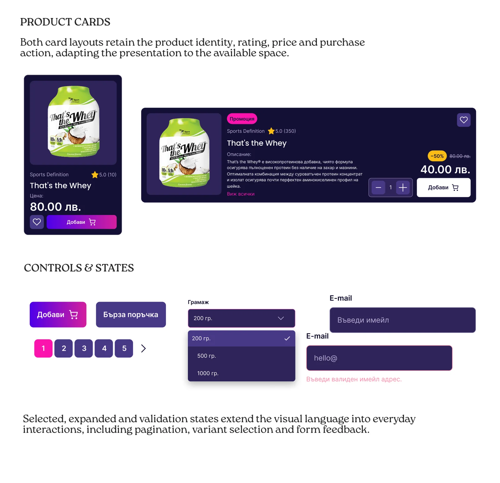
I designed shared product cards, controls and interaction states to connect the shopping pages through a consistent UI system.
Vertical cards support compact product collections, while horizontal cards give catalogue information more room. Both retain the same core product details, so the layout can change without introducing a different information hierarchy.
THE VISUAL FOUNDATION
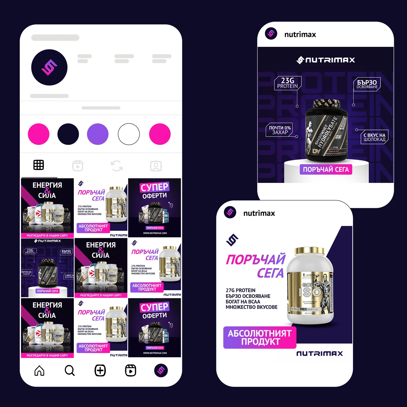
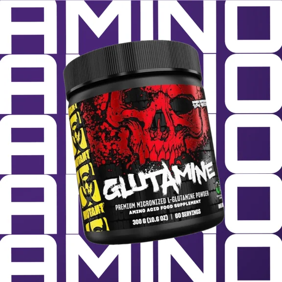
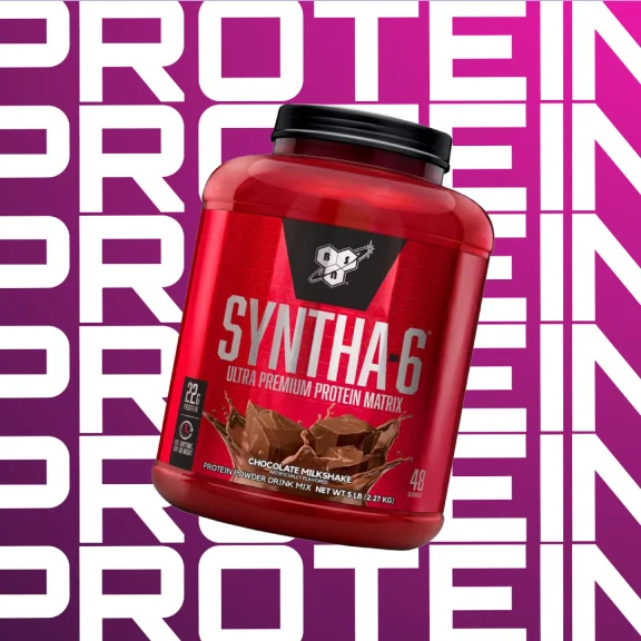
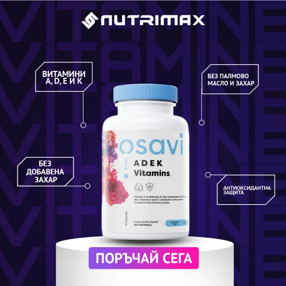
A navy and violet base contains the energy of electric pink and varied product packaging.

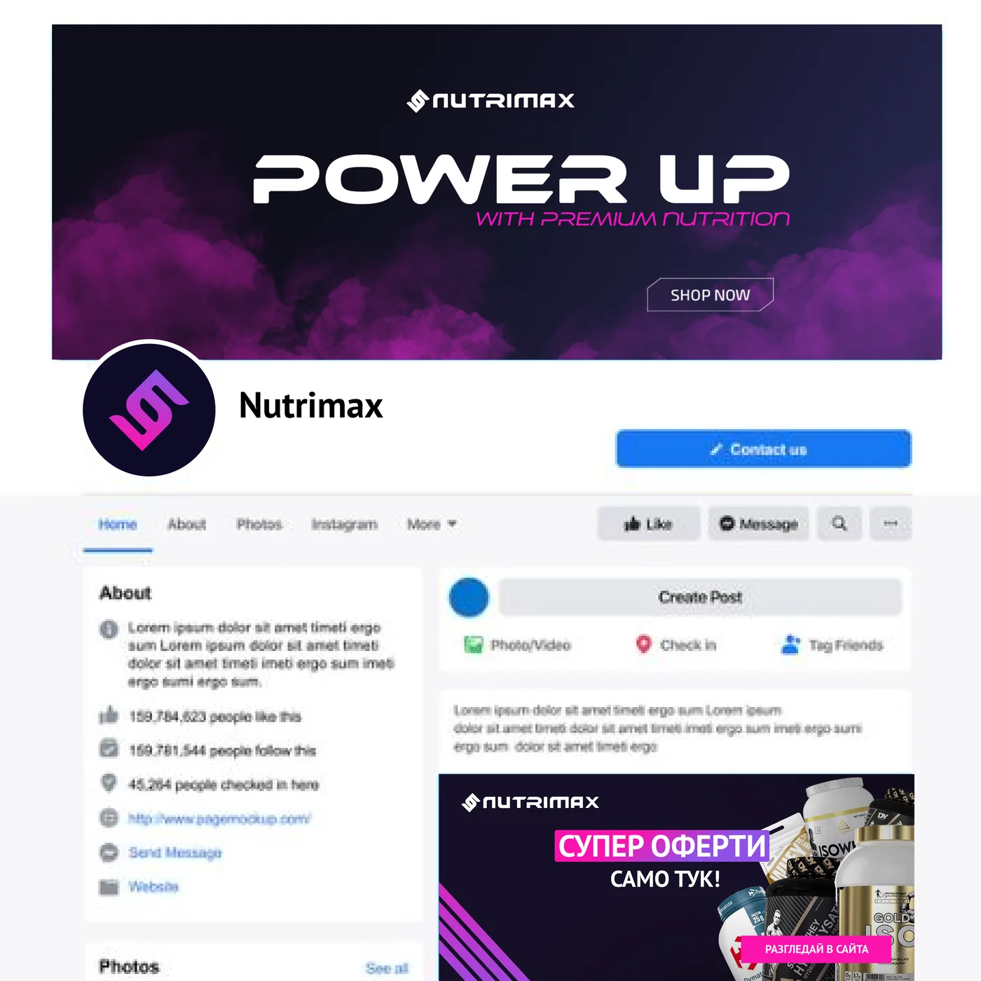
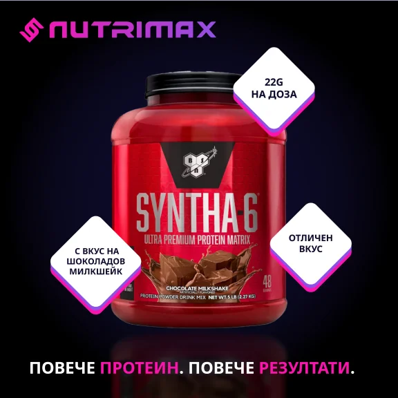
I extended the visual identity across Facebook and Instagram assets, including profile graphics, promotional posts and stories.











DESIGN OUTCOME
The completed design brings Nutrimax's visual identity, product discovery, variant selection and cart review into one desktop e-commerce experience, supported by reusable UI components.
The website is no longer live. This case study documents the completed design; usability improvements and commercial impact have not been measured.
00
A mobile reading app connecting book discovery with personal preferences, mood and music. The project brings together user flows, detailed UI and a visual identity shaped around the reading experience.
Case study coming soon00
A visual identity for a boutique bookstore, built around expressive typography and a consistent design language across print and digital.
Case study coming soon